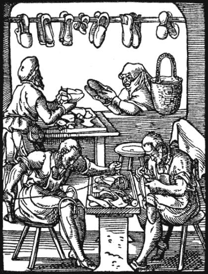
In the past year or so, when I mentioned or thought about the Neo-Archaic website, I often found myself quoting an old proverb: “The cobbler goes barefoot.”
It’s a great excuse to have. Too busy to redesign my own website. How can I even think about wasting so much time? Oh my paws and my whiskers, nearly late for that deadline!
For most businesses, the decision to redesign a website boils down to two questions:
- Can I afford it?
- Can I afford not to?
Even if you already have a web-presence, there is still the need to keep up with the breathtaking acceleration of Internet technologies and social change. Only a few years ago, who ever heard of Facebook or Twitter? Appearance is another deciding factor. Is a “past-best-before” design giving indigestion to your public image? What about engaging your visitors with fresh content? With WordPress, or a similar CMS, you could update and post new content on the go. And speaking of that – do you have a mobile strategy?
So you make your decision and start shopping around for a web professional. Or for an actual pair of new shoes, if that’s what you’re after.
But when it’s your job to redesign your website, it gets more complicated: it’s all about time. Too easy to put everything off until that project is finished, and the next one. Thus the cobbler goes barefoot and ignores the thorns in her foot and the broken glass and the –
At some stage, you simply can’t walk any further without that new website … I mean shoes.
And so, I am pleased to present to you the new Neo-Archaic website: now with more neo than archaic.
What changed? Not just the look.
WordPress & HTML5
The new website was developed in the latest version of WordPress with a bespoke HTML5/CSS3 template. I’ve used Wordpres as my primary CMS for over a year, but now it was time to apply this experience to my own website and also integrate my (long neglected) blog.
HTML5 and CSS3 are just some of the new technologies spreading over the Internet faster than your nosy neighbour’s gossip-line. I used this website as a testbed for these techniques.
Mobile Support
If you view this website on a smartphone, you’ll see a different layout than of a larger screen, but the theme remains the same. Thanks to media queries, you don’t even need a phone to enjoy the benefits. Check it out now: resize your browser window to under 600 pixels in width. A little JavaScript magic even swaps the main menu across the top for a drop-down suited to smaller screens.
Content
The content and tone of the new website is also different. When I started out in the Noughties, it was the done thing to present yourself as a larger company. Even an independent web designer or freelancer simply “had” to use the royal “we”. As a result, I received quite a few internship requests over the years!
This time, it’s personal. I am Neo-Archaic (but not The Law) and feel it’s important for a prospective customer to know that. If it doesn’t suit, you won’t be wasting your time, but if it does, you’ll know exactly who is working on your project.
So here I am, putting on my brand new shoes. Hope they won’t pinch.
I also hope you’ll stay a while to explore the website, and maybe add a comment or two on this post. It’s early days yet, and any feedback is appreciated. The social features are also new. Feel free to check them out by clicking on all those nice Share and Follow buttons …
I’ll just go and put the kettle on.
